Cover Designs: Editions Flammarion
Since Gary started it and KSM continued, I thought I would also join the party.
My three favorite presses in terms of cover designs are probably Action Books, Les Editions Flammarion (France) and Coach House Books (Canada). The first two are very consistent in their designs (in that "Collect Them All" sense that Gary wrote about), Coach House less so, but their books are beautiful on a regular basis (for example, a.rawlings' Wide slumber for lepidopterists or derek beaulieu's with wax). The first two also appeal more to my somewhat minimalist tastes.

French publishers don't put much emphasis on the design of the cover. Or at least, the major publishing houses (Le Veilleur Editions and Al Dante have more American designs). It's somewhat of a tradition in French publishing. What matters is the book. The book you are presented with is Literature, high art. Everything else is extraneous. Eye candy. Even avant-garde writers such as Breton or Eluard received the same treatment during their lifetimes. The cover to Breton's Manifestes surréalistes, for example (a copy of which can be seen at the Menil Collection in Houston), consists of simply in the middle of the field the title in bold serif letters (Garamond, I think) with the name of the author on top also in a serif font, but italicized. The name of the publisher, in normal characters, appears at the bottom. The whole is framed by one or two lines about 2 cm away inside of the edges.
The majority of French publishers play with this format, using different colors or font to identify the publisher's trade dress. For example, a non-capitalised bold Helvetica for the title over an egg-white field would indicated a book published by P.O.L. Editeur (another favorite press, having made available work by Christophe Tarkos and Rémi Froger). The new Claude Royer-Journoud (La poésie entière est préposition) has the text in capitalised Garamond, but not bold, for the title, in red while the other letters are in black, the whole on a canary yellow background.
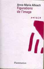
So from a historical and contextual point of view, the books published by Flammarion (one of the largest publishing houses in France) stands out a bit. The name of the author and the title appear more or less in the same size, although in different colors. We are still working within the tradition of French publishing, the serious kind. The book has an air of importance by its modest design still. But some more visual elements enter the field too. In Albiach's book, a doodle by Claude Royet-Journoud, in Tellermann's book, a sample of her handwriting. Not much, just enough to identify the book and its author.
My three favorite presses in terms of cover designs are probably Action Books, Les Editions Flammarion (France) and Coach House Books (Canada). The first two are very consistent in their designs (in that "Collect Them All" sense that Gary wrote about), Coach House less so, but their books are beautiful on a regular basis (for example, a.rawlings' Wide slumber for lepidopterists or derek beaulieu's with wax). The first two also appeal more to my somewhat minimalist tastes.
French publishers don't put much emphasis on the design of the cover. Or at least, the major publishing houses (Le Veilleur Editions and Al Dante have more American designs). It's somewhat of a tradition in French publishing. What matters is the book. The book you are presented with is Literature, high art. Everything else is extraneous. Eye candy. Even avant-garde writers such as Breton or Eluard received the same treatment during their lifetimes. The cover to Breton's Manifestes surréalistes, for example (a copy of which can be seen at the Menil Collection in Houston), consists of simply in the middle of the field the title in bold serif letters (Garamond, I think) with the name of the author on top also in a serif font, but italicized. The name of the publisher, in normal characters, appears at the bottom. The whole is framed by one or two lines about 2 cm away inside of the edges.
The majority of French publishers play with this format, using different colors or font to identify the publisher's trade dress. For example, a non-capitalised bold Helvetica for the title over an egg-white field would indicated a book published by P.O.L. Editeur (another favorite press, having made available work by Christophe Tarkos and Rémi Froger). The new Claude Royer-Journoud (La poésie entière est préposition) has the text in capitalised Garamond, but not bold, for the title, in red while the other letters are in black, the whole on a canary yellow background.
So from a historical and contextual point of view, the books published by Flammarion (one of the largest publishing houses in France) stands out a bit. The name of the author and the title appear more or less in the same size, although in different colors. We are still working within the tradition of French publishing, the serious kind. The book has an air of importance by its modest design still. But some more visual elements enter the field too. In Albiach's book, a doodle by Claude Royet-Journoud, in Tellermann's book, a sample of her handwriting. Not much, just enough to identify the book and its author.

Comments